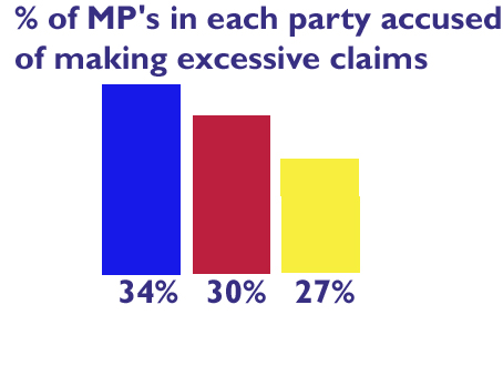
 I know there's not much point reblogging something the omnipresent Iain Dale has already covered, but this graph, from a Liberal blogger, is really special. It's a great selling point - "we're 3% less at it than Labour, and a whole 7% less at it than the Tories". Inspirational stuff.
However, as usual with Liberal graphs, the bars are properly dishonest. It's obvious: the 3% between Labour and the Liberals looks significantly wider than the 4% between Labour and the Tories.
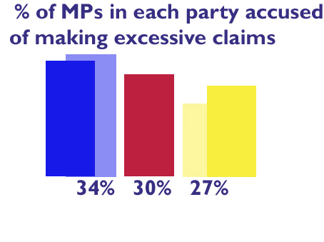
The misleading effect, overall, is to make the Liberals look better, relatively, and the Tories worse. I've redone it in true proportion, with Labour as the arbitrary baseline. Even when they're mocking themselves they can't help fiddling the bar charts, it seems. The faded-out bars are the originals for comparison.

I've also removed the annoying shopkeepers' apostrophe. It's not as bad as "only the Liberals can win here", but it surely does grate.
Note: I haven't checked the original 34%/30%/27% figures, and am just taking his word for that. This will probably prove to be a mistake.


You'd think the Liberals of all people would at least be - ahem - proportional.
Apart from that, I've often pondered about "MPs". Shouldn't it be "MsP" or "MsoP", with the Scottish equivalent "MsSP" or "MsoSP"
At least then, when talking about our representatives, we could all break into a chorus of that old Hanson song.
The Tories are at it too, according to this post which I found (hilariously) on Lib Dem voice..
http://www.libdemvoice.org/death-by-bar-chart-tories-plotting-to-kill-in-norwich-north-15375.html